„Lange Nacht der Bilder“ is an annual art exhibiton taking place in Lichtenberg, Berlin. On the last Friday in September Artists all over the district open their studios to the public. There is also a central venue by which the district mayor makes his (also annual) official opening speach. From 5 p.m. until midnight „uncensored“ art is at display – meaning that any artist located in the area can enlist.
There is also a catalogue. I have taken a look at the artworks presented and compiled some statistics. I guess it must be of interest to know what such a conglomeration of colleagues are making up “together”. Download the catalogue from the exhibition website.
Technique, aesthetics and contents
I have classified each artwork by three dimensions: technique, aesthetic orientation, and contents. Technique is divided into classical (painting, drawing, collage, and sculpture), photography and installation+. By aesthetic orientation I mean orientation towards beauty versus orientation towards ugliness. If you are new to judgement in contemporary art, you may find it surprising that some artworks are deemed (wilfully) ugly. But my claim is that some artworks are like that. Contents in my statistics may come out clear or enigmatic. Abstract art is classified as „enigmatic”. It is the immediate accessibility of the artwork which is (crudely) assessed, not the quality. A landscape and any face I consider to be clear in contents, even when, say a landscape painting, may carry a metaphoric meaning which it can take some background to understand. At least you know where to „start“ when looking at an artwork being clear in this sense.
Beauty on top
I was surprised to see how many of the artworks were aiming at beauty. There were 38 pieces (48 percent) and only 11 went for ugliness, according to my assessment. This I hold to be contrary to today’s typical (contemporary art) museum experience.
However, as many as 30 pieces I have classified as aesthetically „neutral“. By those, the artist does not seem to care. The artwork may sometimes appear more like a documentary than an artwork.
Unsurprisingly then, in some artworks, you find a more or less odd mixture of beauty and ugliness. Birkedal’s is one example.
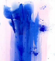
There is harmony in colours and composition, but there are also ugly „splashes“. (I counted this one as „neutral“.)
However, Chacon’s pen drawing below exemplifies a completely different combination of ugliness and beauty.
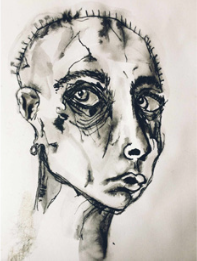
The face is old and wrinkled. But the face is drawn with skill and empathy, leaving the artwork as such in my opinion beautiful.
Classical technique
Also somewhat surprising: we (artists in Lichtenberg) are mostly classical, or you could even say traditional, in technique. 49 works presented out of 79 were sculptures, paintings, drawings, collages, and similar. Again, this is contrary to what you will find in the main exhibition hall of Hamburger Bahnhof. Moreover, there were 19 photos (including videos). Only 11 works I have classified as installation, performance, and other „exotic“ techniques.
Contents
An artwork with no contents is empty. However, as stated above, I have not tried to assess the richness of the 79 artworks found in the catalogue.
Out of the 79, 33 state with clarity what the artwork (at the outset) is about. But of course, even artworks that are clear in this sense, are not always dealt with in a moment.
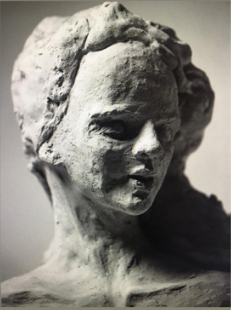
For instance, I find the sculpture by Mahle compelling. I would have liked to meet this person!
Regarding the one below, I am not so sure. The image (photo) is titled „The Wise“, but except for the cliché-like beard and grey hair, I cannot see much wisdom here. If this man is wise, the artist has in my opinion failed to show it.
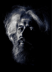
Other examples of „clear“, but not convincing: Martinez, page 25, Schreck, page 47. I find the images banal.
The remaining 46 artworks leave open to the public where to “start”. I have classified those as „enigmatic“, because you cannot readily see what they are about. Below we see some reliefs at the wall, which I think may be worth a closer look.
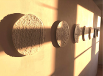
Perhaps the texture when seen “live”, will give you something.
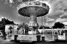
By the next image, however, the question is rather: Why is this photo (titled simply Karussel) in the art catalogue at all?
Good or poor art?
It should now be clear that three dimensions do not aim at distinguishing between good and poor art – not even „aesthetic orientation“. I hope the dimensions defined and the statistics offered can still be useful. We need orientation as a step towards judgement.
Artwork of the fortnight
The artwork of the fortnight was found on page 17. The image immediately caught my attention. In particular, I find the yellow light captivating.
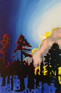
The light is behind the landscape as well as integrated into it.
In the world of humans, I believe “light”, metaphorically understood, plays a similar, dual role. Enlightenment, say, casts light on our existence, but not only that. Modern consciousness – which we can call the enlightened mind – is an integral part of our very being.
- See also Judgement
Schreibe einen Kommentar